Five (More) Scrapbook Example Layouts using Circles

Continuing on from my previous post on scrapbook example layouts using circles here are five more examples of how to use circles in your scrapbook layouts.

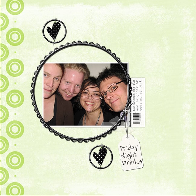
The various scrapbook layouts below includes the use of clustering; white space; minimalism and adding everything you have to the layout.

Scrapbook Example Layout Using Circles 1
Scrapbook Example Layout Using Circles - Masculine, Boy
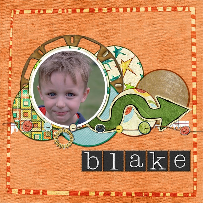
This is another example of scrapbook for boyfriend ideas using circle design elements.  Clustering is used here, with a curved arrow adding even more curves to the cluster of circles.  The wonky striped frame and the squared block alpha contrasts well when compared to the circular elements.

I almost always ink the edges of all of the elements cut out of patterned paper, as this creates contrast. The extra contrast adds to the cohesion of the design, and consequently makes it flow better.

Materials: Dinner Party Alpha designed by Shabby Princess, Smartie Partie digital elements designed by Suzanne Walker, Fabarooni, Fabulicious, Fabulosity digital elements designed by Lauren Bavin

Want to learn more scrapbooking layouts using circles? Click here and check out our book full of amazing scrapbooking layouts!

Scrapbook Example Layout Using Circles 2
Scrapbook Example Layout Using Circles - White space, Minimalist
This example layout uses only a small amount of elements in total. The style is therefore minimalist.  The circles in the background paper, add to the repetition of circle elements on the page.  Minimalist style layouts can be very striking as they automatically draw your eyes toward the focus of the layout, the photo.

Materials: La Dee Da Add on Pack digital elements designed by Nicole Young, Choc Mango Smoothie, Kiwi Fruit Crush digital elements designed by Lauren Bavin

Wait! Now That You Have A Theme For Your Layout, Then You'll Need To Know What Techniques To Use....Let Me Show You...

♥How to START and FINISH a layout to perfection (so no more pushing things around on a page for hours and hours).

♥How to get your creative juices flowing again so you'll NEVER experience scrappers block again!

♥How to always have the perfect scrapbook layout for every occasion!

Scrapbook Example Layout Using Circles 3
Scrapbook Example Layout Using Circles - White space
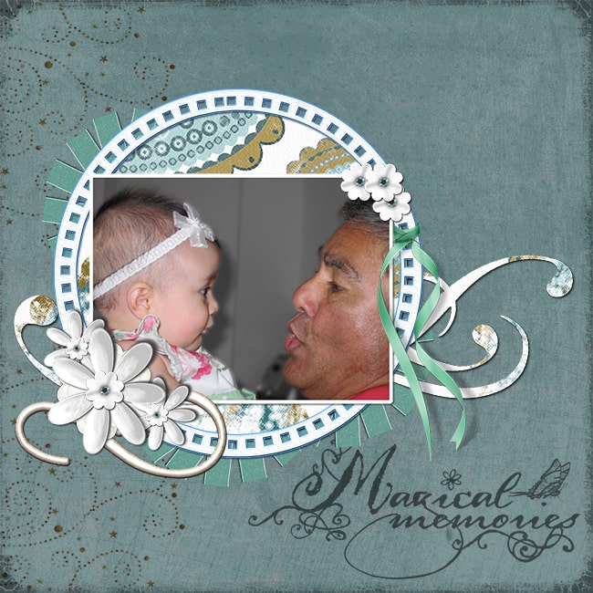
This layout also takes advantage of white space to focus the attention on the photo.  The general idea when using white space is that there is uninterrupted space outside of the focus element.

The circle elements in this layout unify the design and also work well with my dad and niece's round cheeks in the photo.

Materials: A little More Whimsy, Sweet Summer Breeze digital elements designed by Lauren Bavin, Summertime Blues digital elements designed by Suzanne Walker, Tiny Bubbles digital elements designed by Rene Bross, Spring Bling 2 digital elements designed by Nicole Young

Scrapbook Example Layout Using Circles 4
Scrapbook Example Layout Using Circles -Embellishment Overload
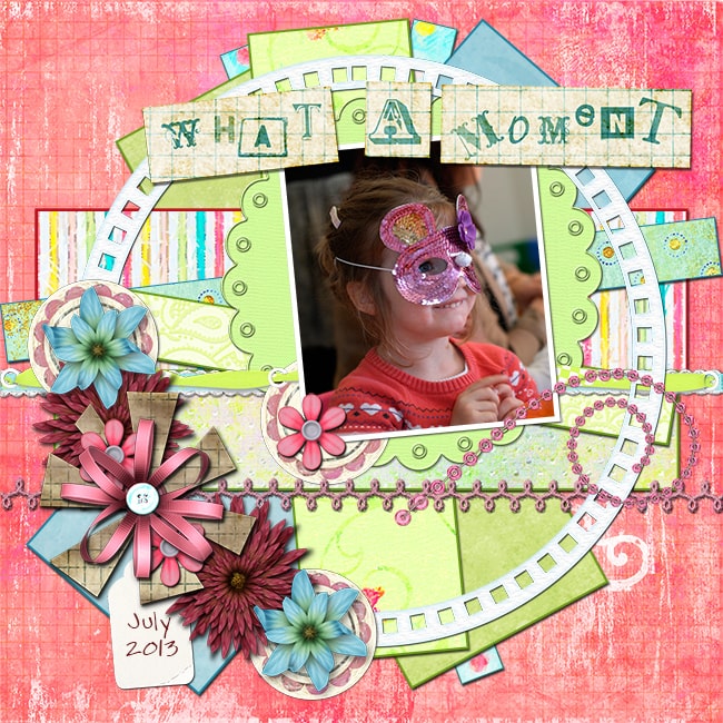
The principle of this layout is the 'over' use of page embellishments to add a sense of fun and business. When working on a layout like this, it is important to add and remove elements along the way. This will give you a good feel for if the embellishment is adding or taking away from the design.

The large circular frame is the most significant element for tying the layout together.  The cluster of elements in the bottom left serves to anchor the layout to the page. The rest flows towards Hannah's gaze off to the top right of the layout.

Lastly, all the strips cut out of patterned paper may be rectangular but they are placed in a spiral rotated around the center of the unifying circle frame.

Materials: Fluttermore, Frozen Margarita, Limonela, Sweet Summer Breeze digital elements designed by Lauren Bavin, Bubblegum Dreams, Oh So Sugarlicious, Sugarlicious, Sugarlicious Add on Pack digital elements designed by Nicole Young

Scrapbook Example Layout Using Circles 5
Scrapbook Example Layout Using Circles - White space
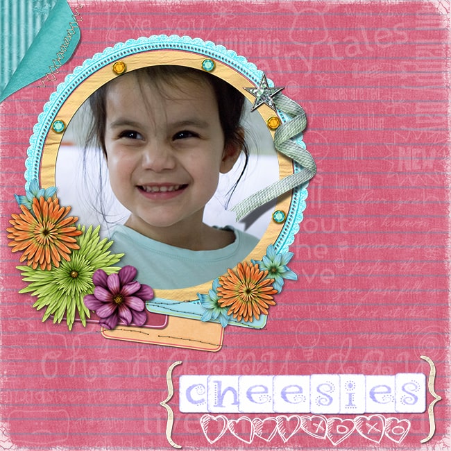
This last layout again uses white space around the photo. Charlotte therefore automatically draws our attention. The photo is anchored to the page using lots of circular flower embellishments in clusters around the circle frames. Using odd numbers of elements in clustering appears more pleasing to the eye.

The page title and page fold also add interest to opposing corners of the layout. "Cheesies" is the prompt word we use to get my niece Charlotte to give us her most cheesiest smile for the camera.

Materials:  Spring Breeze Alpha designed by Shabby Princess, Eeenie Meenie, Frozen Margarita digital elements by Lauren Bavin, Spring Bling, Sugarlicious, Oh So Sugarlicious, Sugarlicious Add on Pack digital elements designed by Nicole Young, Live out Loud digital elements designed by Marcee Duggar

Want Even More Scrapbook Examples?
If you'd like to see even more incredible ways to use circles (and other shapes) in your layouts, then have you checked out our 525 Scrapbooking Sketches?

500+ ready-to-go scrapbook sketches that you can copy or just use as inspiration. Either way - our sketches will make your scrapbooking fast and easy.
Loading...
OUR BEST SELLING BOOKS
HERE'S SOME OTHER SCRAPBOOKING ARTICLES THAT YOU MAY FIND HELPFUL
The Top 5 Scrapbooking Tools That Are Proven To Help You Create Better Layouts
 
12×12 Scrapbook Layouts Tips You Should Never Miss!
 
5 Tips To Creating Catchy Scrapbook Titles For Your Layouts
 
TOP 5 Scrapbooking Ideas I LOVE!
How to Scrapbook: The Ultimate 'Learning How to Scrapbook for Beginners'
 
Scrapbooking Tips: 10 Tips To Help You Create Even More Enchanting Pages!
 
 
Scrapbook Stores Online: Shop from the Top 7 Best Craft Stores
Copyright © 2023 by ScrapbookingCoach.com
We accept payment with: